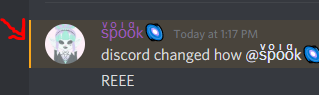
recent redesign for ping/mentions is horrible

The redesign for discords ping/mention tags are horrible, they're extremely bright and look very washed out, It's incredibly jarring on the dark theme, not to mention it makes reading the name harder due to the colour/brightness similarity between the text and background.
Who on earth change tested this and thought it was a good idea?
-

Agree, the bright white text looks terrible imo. I also don't like how when you see a post you are pinged in, your own username is just white like the rest of the text. If nothing else, I wish they would at least make your name match the bold color on the left side of the text block so it stands out more.
 5
5 -

I agree, this change is not good.
4 -

Please, revert back to the good old design, it feels more easy for the eyes.
4 -

Agreed, please revert the change. It made readability worse putting the names in that bright white text. Going through emote reactions now is also more difficult because of the change to the number of reactions being bigger in size and the outline is very unnecessary.
4
Bitte melden Sie sich an, um einen Kommentar zu hinterlassen.
Kommentare
4 Kommentare