Highlighting users on dark theme looks worse with new UI

Since the new UI has updated, I have noticed that certain features on the UI, primarily the one where if you mention someone, their username is highlighted, has looked more awful on dark theme to the point where I have to switch to light theme just so it doesn't look as badly.
Below is an example of the difference between dark and light themes thanks to the UI: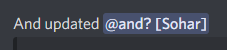

I feel that the blurple background should be removed for dark theme except as an accessibility option, and the text should be blurple instead of the background.
-

Oh gods. I mentioned myself in a server of mine to test that and my brain doesn't even recognize that as a mention, this is bad
2 -
I do recognize it as a mention personally, but it just feels too garish in dark mode compared to what it had been before, or even in light mode, where it is at least legible.
0
Bitte melden Sie sich an, um einen Kommentar zu hinterlassen.
Kommentare
2 Kommentare