Accessibility issues with the new design change

As someone who is on the autism spectrum, has ADHD, and has Irlen Syndrome, the new design changes are wreaking havoc on my visual processing.
The various pings and channel links are significantly harder to read, and there's something off about the contrast that makes it difficult to keep my eyes on the text.
Additionally, both the login page and this support site are completely blinding, and I can feel a painful pressure in my eyes if I look at it too long.
One thing I've always loved about Discord is how easy it was to look at. It never hurt my eyes, and I never had to struggle to read text. This is no longer the case.
-

I have autism and ADHD too and am having the same problem. I’ve used this app on a daily basis for literally years and I dread looking at it now. I had to move it off of my home screen on my phone because of how much it hurts my eyes.
6 -

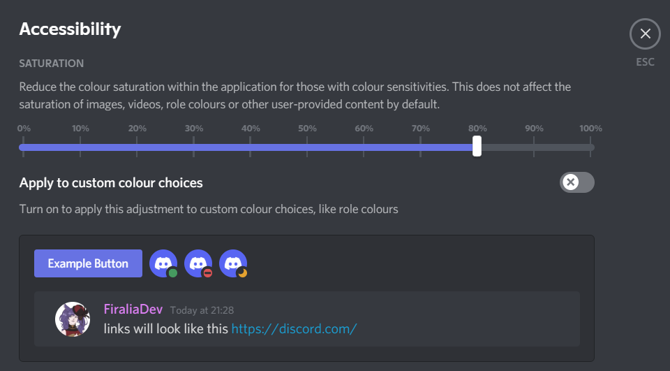
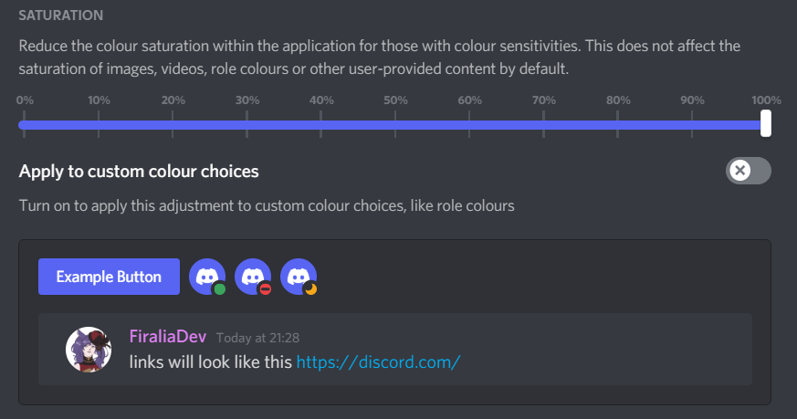
I know this was posted a few months back, but there is an accessibility option where you can toggle the saturation of the pings and logo. It makes it MUCH better as someone that also has ADHD!
It's pretty much like it used to be when you do that.Unfortunately it's not on mobile yet, but I really hope they do bring it over there because it is a great feature.
With:
Without:
 0
0
Bitte melden Sie sich an, um einen Kommentar zu hinterlassen.
Kommentare
2 Kommentare