Option for Classic. Please.
Logo
Symmetry
A little secret: our old logo wasn't even symmetrical. No, seriously. Both the top and bottom of our old logo were totally wonky to a keen eye. Which in a way was charming, but mostly embarrassing.
I can say this is true. But the only time I noticed this was when I tried to do a pixel art version and zoomed in several thousand times, I'm not sure if that's a keen eye anymore.
Haters beings haters
And not only was our logo secretly messed up, but over time as we grew, we realized it was more of an enigma. What even was it? We asked people who were new to Discord and heard answers like gaming controller, pig snout, Mickey Mouse pants and...ugly :(
Wh... what? No offense but, this sounded like you asked a child that sarcastically responded "gaming controller lol" and you took it seriously.
Gaming Controller
If anything you made it worse, the old Discord logo had streaks on top, gaming controllers don't, thus giving a unique touch to the logo. The new Discord logo replaced it with pads, which in a twist of irony makes it look like a gaming controller.
Pig Snout
The holes in the logo are slightly larger in proportion to the rest of the logo. This... this is too ironic.
Mickey Mouse's pants
Both images are simple, it's not uncommon for them to collide with other symbols. I could draw a trapezoid with eyes and thick legs and someone would call it mickey mouse pants
Trademark
And they weren't wrong. It was hard to nail down what it represented besides just...Discord, and in a way, gaming.
But it's ours, and it's distinct, so we're keeping it. Kinda. We're buffing out the imperfections and making our weird, pig-snout-Mickey-Mouse controller a bit friendlier to everyone, no matter your interests.
While the claims may be correct, that doesn't mean the logo is bad. As you've mentioned, the logo drew you out, the logo made you unique, the logo is your trademark! Going by the same logic, I don't see how it's more "welcoming", as I've mentioned, the new logo looks much more like a gaming controller than the old one.
All in all, the logo isn't that big of an issue for me, but that changes made to address the claims are ironic.
Colors
But, I digress. I came here to criticize the new colors not the logo
Ping
I don't really see a reason to change the ping color, the blue color had a higher contrast than a this
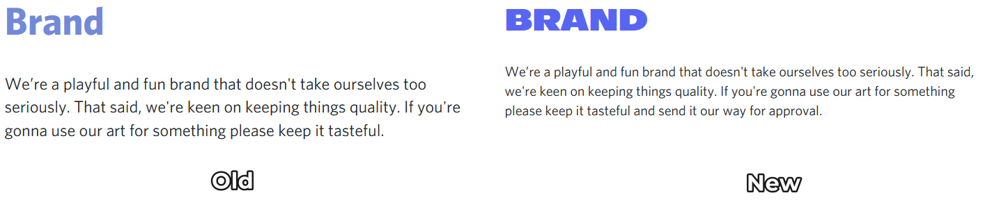
Brand Colors(Mostly Blurple)
These are the old colors. Smooth, contrast-y, recognizable, and non-blinding(except full white ofc).
These are the new colors. Contrast? Yes definitely. Recognizable? Well maybe not yet. Smooth? No. Non-blinding? Most definitely quite absolutely a NO. They're straight-up bright neon(except black ofc), trying to even read their labels hurts my eyes. I'm not saying they're bad colors, but neon doesn't work in either Dark or Light.
Font
Sorry but, WHAT? What in the world is that font?
I get that you want to reach out to a bigger audience but, the old font was alright, more accessible, and more professional. The new font -- no offense -- looks straight out of Fortnite. The very same audience the child-like font is trying to reach is VERY banned on this website due to data privacy and child protection laws like GDPR, COPPA, etc.
-

Oh, holy moly!
That "Brand" font change, new v old. The new looks like a parody.
10 -

Brilliant side by side post and addressing of the issues this rebrand has brought.
7 -

Your post is by far the most classy and well written one i've seen on the matter yet.
3
Bitte melden Sie sich an, um einen Kommentar zu hinterlassen.
Kommentare
3 Kommentare