New UI sucks. Reaction and @ highlights are jarring. Color changes look worse.

The change to the reactions to add those bright bubbles is ugly. The highlight on the @ person's name is jarring and distracting.
These are awful UI changes. Revert or give us an option to disable/opt out of this wack change.
It's actively unpleasant to look at, it's a pointless change, and it destroys the subtler look of Discord's UI. The color changes are also awful.
It's bad enough that it motivated me to actually leave feedback on here for the first time ever. It's agitating and awful.
Go back, this ain't it.
I hate it. Fix this and revert it.
-

I actually like the new background colour on reactions more, but the shape is way too big! On the colour changes with mentions: I agree
-7 -

This is way worse than the major UI revision Discord had. It looks horrid!
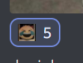
This does not look good! Did they only test it with Discord emoji?!
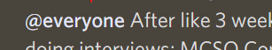
@everyone is just bold text now, with no way to indicate it's an actual tag. This is so dumb as well!
 16
16 -

It really looks terrible
7 -

The light mode is bleeding through dark mode. It hurts my eyes every time I mention or see a reaction. There should at least be a way to revert back to the old UI.
13 -

This update made me to go to the feedback forums for the first time. I really dislike the new UI.
14 -

Same. I've disagreed with other changes in the past but this is the only one that's made me upset enough to actively give feedback. It's less readable, it's ugly, it clashes with the rest of the UI, and the old design was good already.
1 -

Well, if the goal was to make Discord look more like Microsoft Teams, they succeeded, which in itself is a failure; I would not wish Microsoft Teams upon anyone.
0 -

+1
0
Please sign in to leave a comment.
Comments
8 comments