The new "brand look" is a nightmare

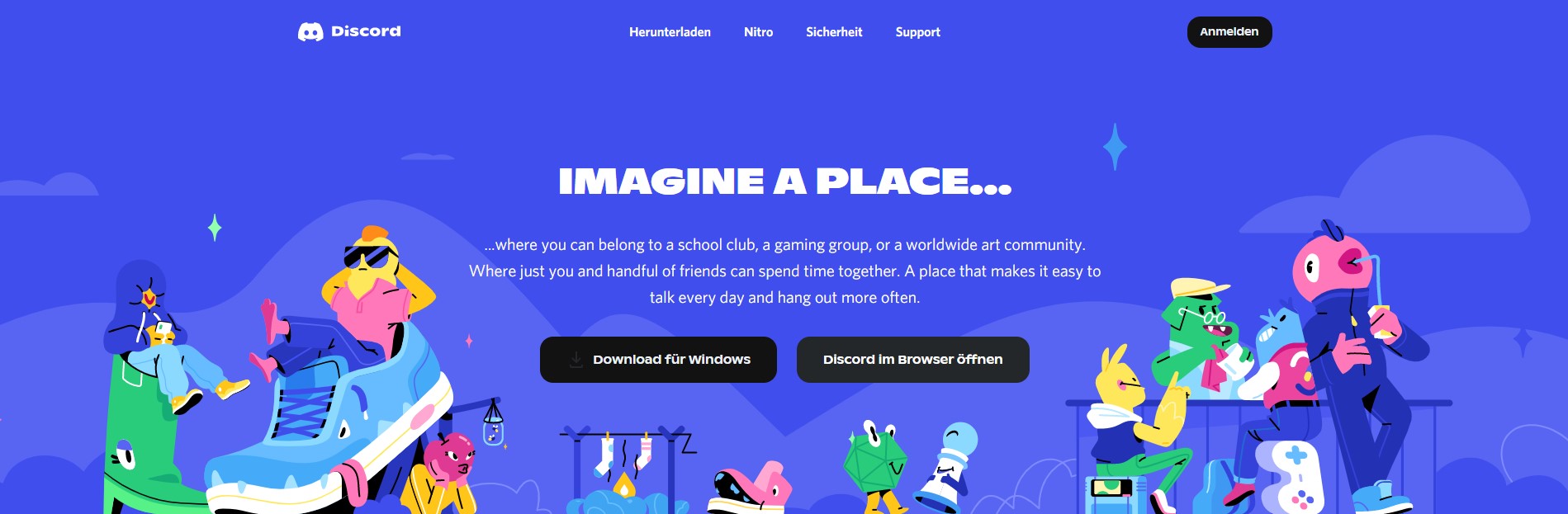
The new color, some weird neon indigo, is a real strain on the eyes. I don't consider myself visually impaired in any way but it gives me a headache and makes my eyes cross. While I understand the intention was to "bring more energy to Discord" by "brightening up the colors to be more bold and playful" this genuinely hurts the eyes and makes the platform nearly unusable. I don't expect a full-on reversal, but there needs to be a setting to reverse it to the OG Blurple. This is torture on the eyes.
The new text font looks like someone stretched out Arial Black. It's awkward, hard to read and extremely bland from a branding perspective. There's nothing unique about it, nothing that stands out from any other basic font.
The idea behind these changes were supposedly to make Discord a friendlier and more playful looking place, and instead the neon colors make it look loud, aggressive, and off-putting. This isn't even a "I don't like change" issue, this is a genuine problem that will persist unless something is changed.
A toggle is all this needs.
-

Yes to all of yours and: I don't know if their web page has been like this for a longer time, but everything is giving a strong "this is a kids platform" vibe. You can't tell anyone, who does not know discord already you are using discord, because they will think you are a pedo after looking at this...
 4
4 -

This visual update is clearly not a feature but a bug. Please fix
2
Please sign in to leave a comment.
Comments
2 comments