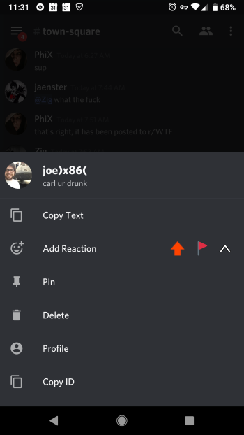
Message Delete and View User Profile buttons are too close on Android

When an Android user holds down a message to view the on-screen message options, the buttons Delete and Profile are right next to each other. This presents two problems:
1. A user who has big fingers or accidentally drops their phone, intending to click Profile, is prone to accidentally clicking Delete instead of Profile.
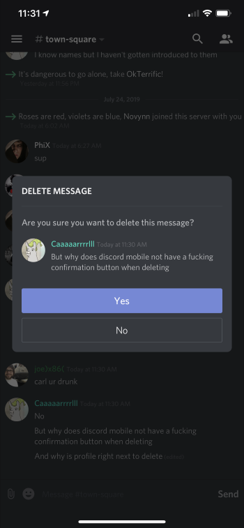
2. When Delete is pressed, there's no confirmation dialog like there is on iOS and the desktop/Electron app, exacerbating the issue since the message is immediately deleted when the user was in fact just trying to view the other user's profile and had no intention of deleting their message.
I was a victim of this crime and UI/UX oversight this morning.
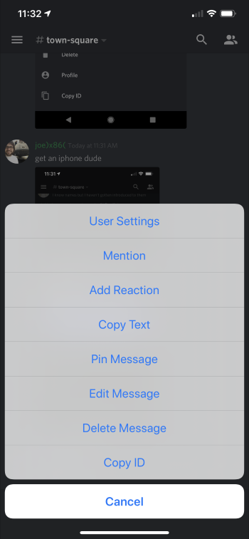
See attached screenshots for examples.
1
Please sign in to leave a comment.
Comments
0 comments