Left side menu, Light theme - Add borderlines, drop shadows and/or more colour

The Light Theme on desktop is relatively bad - light color schemes allow for liberal use of color and benefit from borderlines - slight changes in hue don't feel as different as they do in darker ones. The mobile app has nice borderlines and some drop shadowing in the left bar that makes the different areas of the left side menu clearly stand out from each other. These should be incorporated into the desktop app to make the light theme more usable.
A simple borderline between the server list and the channel list as on mobile would do wonders to the quality of the light theme. A single, simple line and a little bit darker background in the server browser.

It just looks so, so much better with some simple borders.
Of course, there should be an actually colorful "light theme" as well - what we used to call "light themes" before the dark mode fad started were just user interface design that wasn't obsessively dark, and those certainly didn't shy away from using color, borderlines, strong contrasts and some darker design elements. They just didn't actively try to be dark, and that school is easily better than these "white modes" that get slapped onto apps as reversions of originally dark mode designs. They used UI elements that felt like "stuff", like "things", even if they weren't actively skeuomorphic.
Light and dark colorscapes need different designs in the first place, and if you have to adapt one to the other, not-dark/colorful themes adapted into dark themes tend to look better than dark themes dunked in a can of white paint.
Apps having actual color to them also helps alt-tabbing between them since the UIs stand out from each other more.
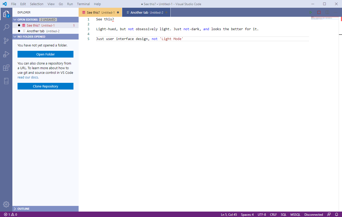
Here's one example:
Please sign in to leave a comment.
Comments
0 comments