Bot label on bot messages distracting in compact dark mode

I used dark mode + compact mode, always have, always will.
With the most recent update there is this new little label that shows up on bot messages, to the left of and overlaying the timestamp, that says in full white letters, "BOT":
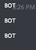
First of all it makes it very difficult to read the timestamp on messages sent by a bot, second of all it is incredibly distracting when I visually scan a series of messages that include human conversation and bot messages. Basically I find that any time a bot sends more than one message in a row, I can only pay attention to the word "BOT" over in the lefthand side of the main content area, where I am not expecting anything to be visually distracting. Also, because I am expecting this area to be dark, the white text appears even brighter than the main text is dark mode. Even though I suspect that the main text color is just standard white, it looks slightly off-white, while this "BOT" message looks very very white. We also are already getting the vertical 'blue' bar before the bot's username, which would be more than sufficient to indicate a bot when you are using compact mode, without being overly distracting:
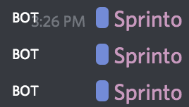
I would love to see that white "BOT" text gone, but the blue bar before the bot username remain in compact mode. I have absolutely no opinion on what you do in the other modes.
Please sign in to leave a comment.
Comments
0 comments