So much clutter

With the sticker additions, the profile renovations, the new banners, the sticker icon taking up more space in the message bar for very little reason, profile popups starting to look identical to Twitter, more prompts to fill in or complete this and that, and even more Nitro advertisements than ever, Discord is starting to feel incredibly cluttered. There's even a "set a nickname" prompt taking up more space in your profile, even though you can change your nickname by right clicking on your icon anyway or viewing the dropdown of a server.
I think the thing that bothers me the most is how the profiles are reminiscent of Twitter now. The new updates are making Discord feel like more of a public social media platform rather than a decidedly private service. Without the possibility of hypothetically seeing others overshare on their profiles, it felt a bit more secure.
I don't have Nitro, but to my knowledge, many many people are complaining about the new stickers, how they take priority over emojis and how much space they take up on the search bar. The most appealing thing about Discord is its potential for minimalistic customization and lack of brand tools, but this seems to be throwing a wrench into that.
-

the amount of clutter on the chat box has become unacceptable at this point- and the fact that I can not disable sticker suggestions is even worse. If the main purpose of your platform is to CHAT, why is the literal message box being the thing shortened, mucked with, and made more and more unusable with each update.
I mean, LOOK at this. I'm someone that often writes large messages- How am i supposed to work with this?
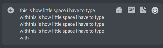
I literally do not use three of these buttons. I don't use the gif menu. I don't gift. I don't use stickers. Why do they have to be on the bar?
In addition, the gigantic window that pops up when typing an emote now is horrendous.

This takes up half the screen for no reason as I have no interest in stickers- Especially as none of these are even relevant to what i'm looking for. And right now there is no way to disable these. I had these rolled out on my account against my will with no way of disabling it.
I'm paying for nitro. I don't want this regardless of if i'm paying for it. Profile banners are cute, but I have to agree that allowing a little profile.... description box is way too cluttery. Or the additional "change server nickname" text, which is redundant. It all is taking up so much space all of a sudden. It feels like I should invest in a bigger screen to even use discord at this point.
6
Please sign in to leave a comment.
Comments
1 comment