UX issue in the login form

Hi there,
I would like to share my little thoughts regarding login form.
The text alerting to confirm login by email is very similar to an incorrect data entry error. The text styling is the same: red small font and the only difference is the line that appears above the password entry field.
Because I'm currently switching frequently between different accounts (work and personal) and on different devices, I sometimes inadvertently mistake the confirmation message as a data entry error.
In my humble opinion as a not particularly experienced UX designer, it would be better to visualize the login confirmation notification via a popup or a new page altogether.
For example something like this: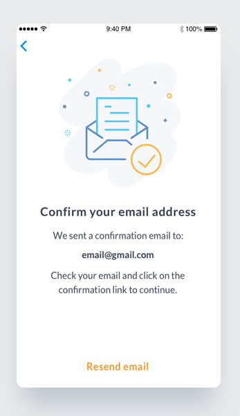
Thanks and good luck to all!
Please sign in to leave a comment.
Comments
0 comments