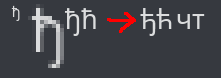
Serbian Cyrillic lowercase letter ђ in new gg sans font looks unacceptable
The letter ђ looks absolutely wrong at certain resolutions. The letter ћ displays alright, but both letters should be redesigned to be more in line with Serbian typographic practice. The letters should be constructed from an inverted ч and the crossbar should be at x-height like т. There is a detailed explanation on this website https://uxdesign.cc/design-guides-for-cyrillic-letter-%D1%9A-nje-how-to-design-cyrillic-letters-%D1%9A-nje-%D1%99-lje-%D1%9B-tshe-f9b565a477cc
Other than that, if possible, the letters п, т, д and г in italic and printed lowercase letter б should have language-sensitive glyph variants for Serbian, but the situation with ђ and ћ should have a higher priority.
-

The GG Sans font does not support Cyrillic and Greek; the issue you see with that letter is the fault of Discord now using Noto Sans as a fallback for Cyrillic languages, something which Whitney perfectly supported. You could try reporting this to the people behind Noto by following the info at https://fonts.google.com/noto/contribute#open-an-issue
2 -
I didn't even notice it used a different font, they're so similar. Thanks for the info
0
Iniciar sesión para dejar un comentario.
Comentarios
2 comentarios