Problems with new Bright colors and stuff

Hey Discord, i know that people are talking a lot about the new UI design (in good and bad) and i wanted to gave my feedback because the UI is something really important for me.
I have seen the changes almost step by step, but that was already too fast for me and some are just hurting myself, i gonna detail what i have to say and give solutions that i see (because criticizing without giving any solutions is not something instructive).
The new colors
I have been a user of discord since something like 2016/2017 if i remember well, and discord became a part of my life. I began to have some problems with my eyes, not something really serious, but they are hurting me a lot, and im working all day on computer so i had to adapt some things like luminosity or colors if that was possible (so i just left the app where i cannot) but discord was already nice, smooth colors and everything fine.
But now that you have changed the color palette my eyes are hurting a lot more on discord, especially with the new blurple, i can understand that can be a good idea to change it, but this one is too bright (the others are ok because their just on small things) and its hard to read the white simple text in buttons with this color, like the Submit button on this form.

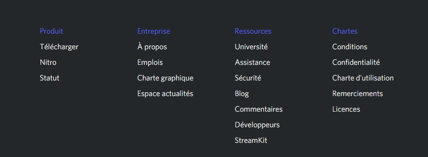
Or just the text with this blurple on dark background, you can take an example with the category title on your footer's website.
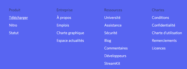
same with blurple on the background and black for the text.
I can understand that people like this color, but its hurting me (and maybe others).
So i can suggest you to have an option in the settings to lower the brightness, to use the older colors, or maybe add custom colors (that can be a good idea for the people who are colorblind, but not that good if you really want to keep your color palette on every user device).
Others things
The new font is really hard to read, there was no problem with the older one, i dont understand why you changed it :/ (and i have to say that in addition to be hard to read, its ugly (i know its really hard to find a font, i dont blame you))
i understand all the things about the logo and your hard work to improve it, but i find that its a bit too sharp, and Clyde look like a bit sadder with this smaller smile, but meh thats not that much important for accessibility right ?
The others things that you changed are not that bothering, it just needs a time for people to used to it.
i think i have said all i wanted, so i will finish with a positive note.
We know that you all are doing your best to improve the discord quality and we are glad to be a part of this community, there were a lot of changes during theses years and i can say that discord quality improved a lot and even become one of the best. And one of the things i really like is that discord is not just a platform to hangout but its the reflect of ourself, we can custom almost everything without loosing the 'discord side'.
You are doing a good job and i hope you'll keep doing it, and continue to make us proud of discord.
With all my respect, Sincerely.
Iniciar sesión para dejar un comentario.
Comentarios
0 comentarios