New mobile UI sucks, and needs to change
Here's my problem/ feedback with the new mobile ui
1. The back button on the server tab needs to go back to hamburger icon, since we're staying with the left navigation drawer. The back button is confusing, and i really hate it
2. Please bring back “Swipe to see details and members of a channel”. I really don't wanna tap the name of the channel or G/DM. Like, it's not necessary to see one page of details and members like this

On that note, can we also just let the swipe left to reply go? I always accidentally swipe left with this phone, and i much prefer hold message to reply.
3. “Your friends” menu on the “You” page should move to the bottom navigation drawer instead of hiding it in the “You” page. Also, just move the “Messages” navigation back to “Servers” menu back. I really missed “Your friends” menu back where it belong

4. I don't really care about my friends activity, so can we make it smaller? It's too big for my taste. Better yet, can we make it so that you can toggle to hide it?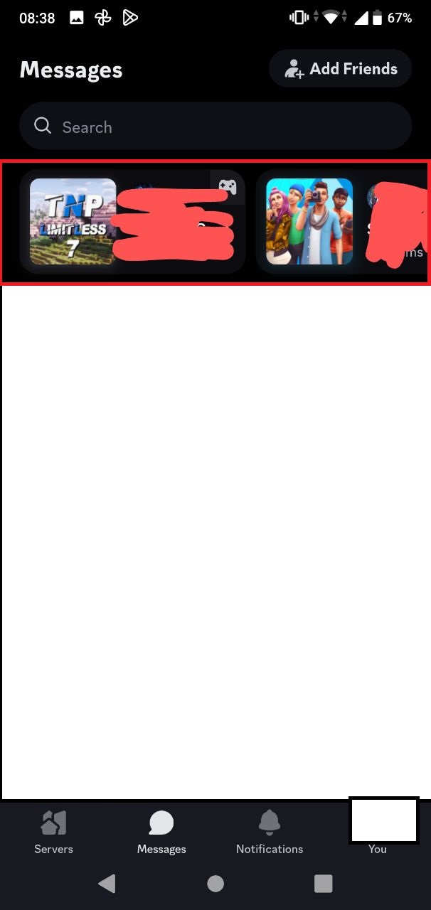
That would be it from me. Please consider it. Thank you.
-

Well said! The friend activity, especially when I'm on mobile is extremely unnecessary. Given how janky streams are anyway, and I can't really join in any games that they'd be playing anyway from mobile… Probably shouldn't be the main thing on that menu.
Nothing really flows anymore, and using the app is just painful like this. Things are just thrown about and it's just bad design overall.
This whole update just feels unnecessary and feedback was not taken from the community.. Hopefully they'll revert or make changes that make it more similar to what it was, but with that fancy new coat of paint they wanted for the app.
7 -

Don't get me wrong, i love some things that they do to this update, like better search on server, but the old one still rules for ease of access. This one feels really, REALLY cluttered.
0 -
I can't agree that search has become “better” on servers – they have literally nuked the ability to search an entire server at once. That has made it so much worse than it was before.
3
Iniciar sesión para dejar un comentario.
Comentarios
3 comentarios