Text box layout suggestion - button bar

Quick suggestion: perhaps reorganize the text input box with a small bar where all the icon buttons go and have the rest of the space below it for actual typing.
Because with the current layout, the buttons for emojis, gifts, gifs, and so forth take up half of the writing text box, squishing all of my text to one side.

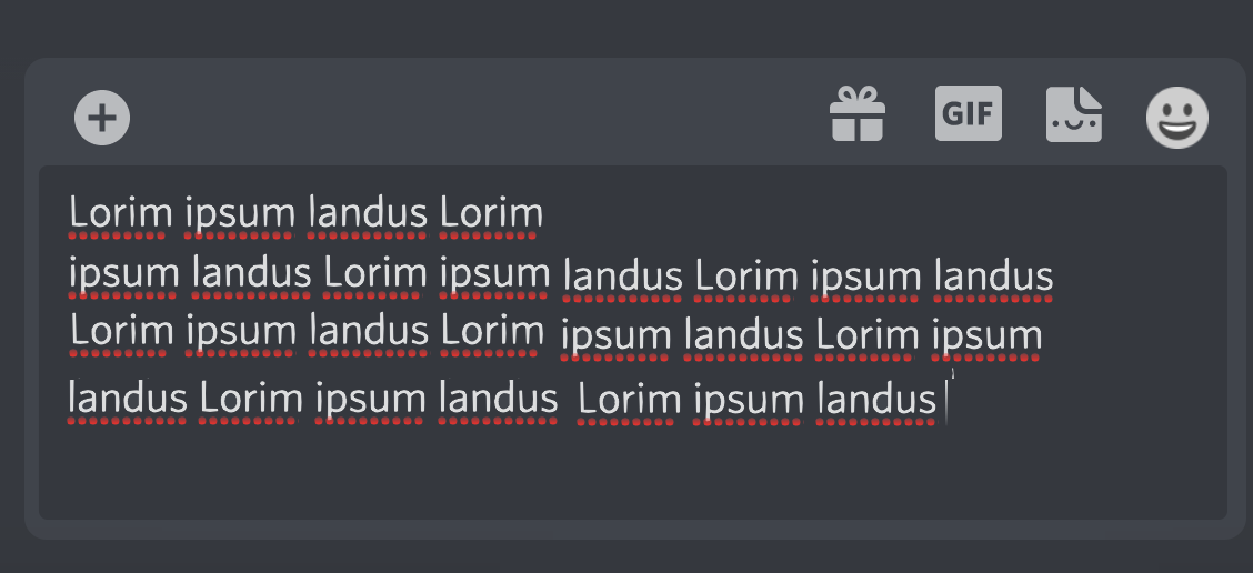
If you could make like, a little bar at the top of the text input box where all of the little icon buttons go, thus leaving the rest of the space beneath it for text, that would be a huge help to me and it would free up a LOT of space in the text box.
Something like this perhaps?
Because with the buttons in a bar on top, they're easier to reach and know where they are without getting in the way of my typing both in the mobile and on the computer app.
Anyways, this would be really helpful and I hope this helps others too.
-

Good idea. But I think the text input should be on top. That way, the position of the icons would be predictable, because otherwise, they would move up every time the text input expands.
0
कृपया टिप्पणी करने के लिए साइन इन करें करें.
टिप्पणियां
1 टिप्पणी