Bring Back the old UI

-

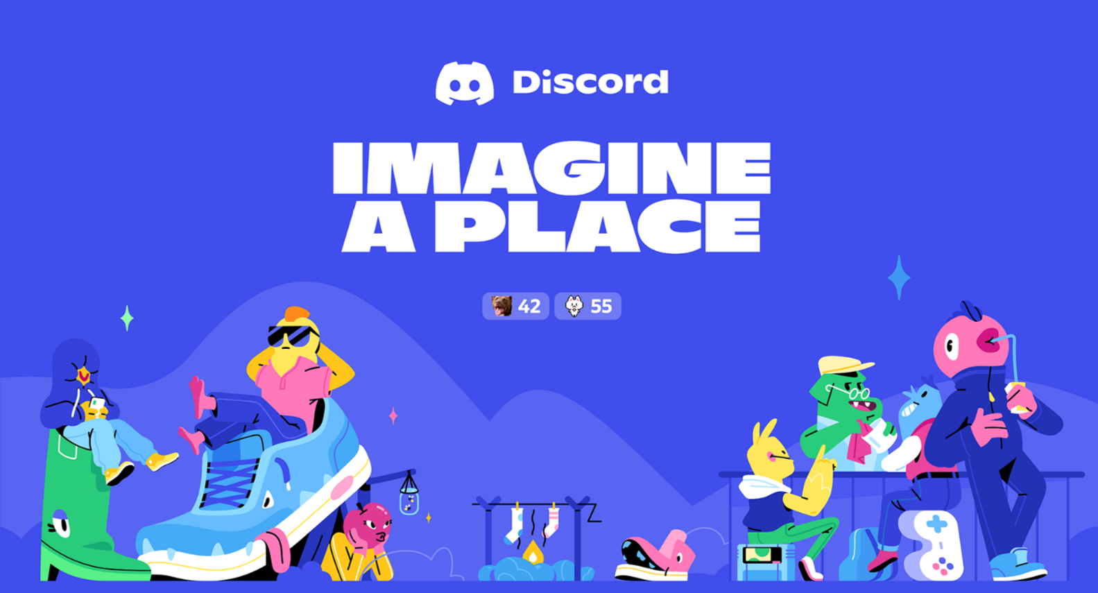
I personally think that the new UI and Icon are TERRIBLE. The icon looks very compact and weird, the FONT is just... Looks a lot cheaper than the old font, and lost its uniqueness with the sliced D. The new slogan is also very unamusing compared to the old one. What does it mean to "imagine a place" FOR WHAT? I think it lost its whole meaning. I'm personally very disappointed with this update... And I really hope we can bring back the original.
 6
6 -

This is my first ever time ever going out of my way to leave feedback on anything. The new Discord user interface is awful. This was a step in the wrong direction.
5 -

This looks like its trying to be kid-friendly, the next club penguin or a Pixar clone from Mexico
2 -

I want to bump this and every choice. If I can find a solution for this via github/a youtube video, then this should be a main feature. Or at the very BARE minumum please add a tab for friends. It's such a hastle trying to navigate to see who is online on your friends list, that I might as well not have friends to begin with.
0
Accedi per aggiungere un commento.
Commenti
5 commenti