Accessibility Issues w/ new mobile layout (Android)

I know there are already posts about this here but I'm going to try and get my thoughts on the newest UI update for mobile out in a little more concise manner without commenting, so here we go.
Before I get too into it though, I do want to say VISUALLY this update was rather good, but the problems come down to function.
First and foremost, at least on phones (unsure about tablets), the new 5-button bar on the bottom is too close to the context bar of Android's OS: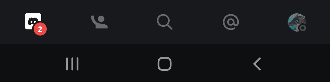
As a taller individual, I have larger hands so I already have issues pressing the wrong keys far too much and I could only imagine others have the same issue, but the spacing and location of these buttons on the Discord UI feel as if they mostly consider those with average sized hands and did not account for the OS's own context buttons (who wants to try searching for something just to close out of the app on accident?)
Secondly, why are we required to press the second of the five buttons just to see what friends are on? It, at least in my opinion, slows down going through the UI by a surprising amount. I could see this simply being fixed by removing the icon on the lower bar and leaving the DMs/PMs attached to the same location as friends and requests (however, where did our ability to see who we've blocked and who's pending gone?)
Thirdly, and this is more of a nitpick here (somewhat similarly to the first point I made), but clicking on a channel should not instantly focus on the contents; mispresses happen and it's already been somewhat annoying to have it instantly show me the channel rather than me going from one to another without another press. This doesn't need to be it's own effective tab: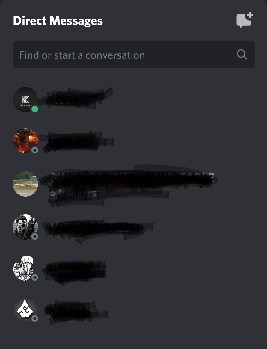
Either way, if the Discord team does not choose to revert or at least modify some of these changes (or at LEAST give an option between the two, similar to chat style), I respect it, but I have heard no one, or at least very few people give positive feedback on this set of changes.
Also hope everyone's doing alright in lockdown (if you're still in it!)
-

As a discord mobile user myself I have to say I strongly dislike the new update. The new bar across the bottom and the bar at the top when in a call make it very difficult to navigate the rest of the app, it was not a good design choice and the previous update look was a lot easier to navigate with on a mobile device. I keep bumping the bar on the bottom while trying to scroll through the different chats I am having as well as bumping my phones context bar which then causes the app to close out. Very much would prefer that I was able to choose between this or the previous look rather than being stuck with it now that it has updated.
5
Accedi per aggiungere un commento.
Commenti
1 commento