The new pop-out window layout for video/screen share previews is really bad.

The new video/screenshare layout for the pop-out window wastes a ton of space, moves the userlist to a place I don't want to look, and is overall just a bad experience.
I enjoy being able to see the names light up so I don't want to just hide them outright, but this new layout is incredibly bad. There is basically enough room now for the member list how it was before on each side, which is extremely obnoxious. If the issue was having it on the left and you wanted it on the right, why not just add a toggle?
In case you haven't seen it, this is the new layout. 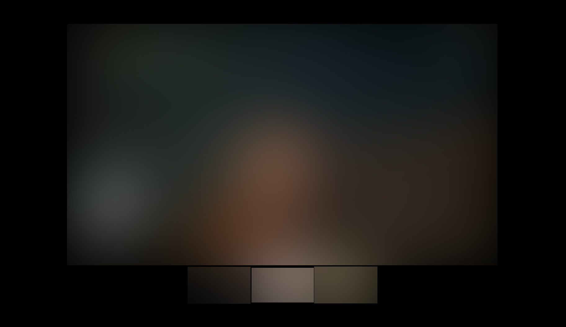
-

true
1 -

I have sent tickets for this matter. It looks like we are stuck. This makes me sad.
2 -

I want to opt out of this layout, it makes the video conferencing so much less usable for me
2
Accedi per aggiungere un commento.
Commenti
3 commenti