Strongly dislike the new bold text font
I don't know if its just me but I find the new bolded text to be too big and dumb
Here is the old bolded text within an embed created by a yugioh card bot I made, here it looks really nice and clean all around as its still bolded but proportionate to the text around it

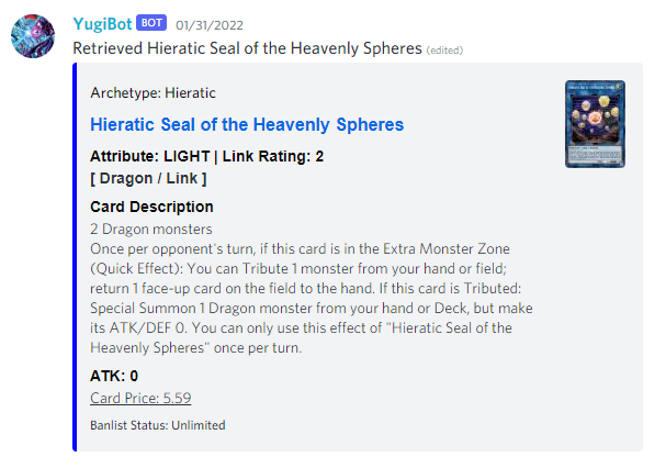
Now here's the new bolded text, it looks strange to me because its bigger, bulkier, and some of the spacing of the letters makes it seem like there's an extra space hidden, between the v and the o specifically, that really catches my eye and it feels less like bolded text and more like the font size was jacked up. On top of that the text is now sized disproportionately while bolded and it's not something I can control within an embed where the name of each field is bolded by default. The new bolding also causes words between brackets makes words seem too big to fit between them as the letters are all much larger, if you look closely at the word trap in both images, it doesn't fit so well in the second as it does in the first image
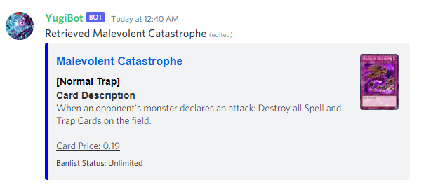
In conclusion, please go back to the old font size for bolded text, and keep this as an option for people who have a harder time reading bolded text in an accessibility option for those who may be hard of sight or just want different font scaling, but personally I find the new bolded font to be not so good. It just looks weird in contrast to other text on the screen, like a poorly photoshopped report card
edit:
I just saw the new font on another card post and its even more atrocious here, the spacing looks absolutely terrible like its double spaced, but nope, single spaced
Accedi per aggiungere un commento.
Commenti
0 commenti