The new orientation for call members in the call screen is worse than it was before.

To whom it may concern,
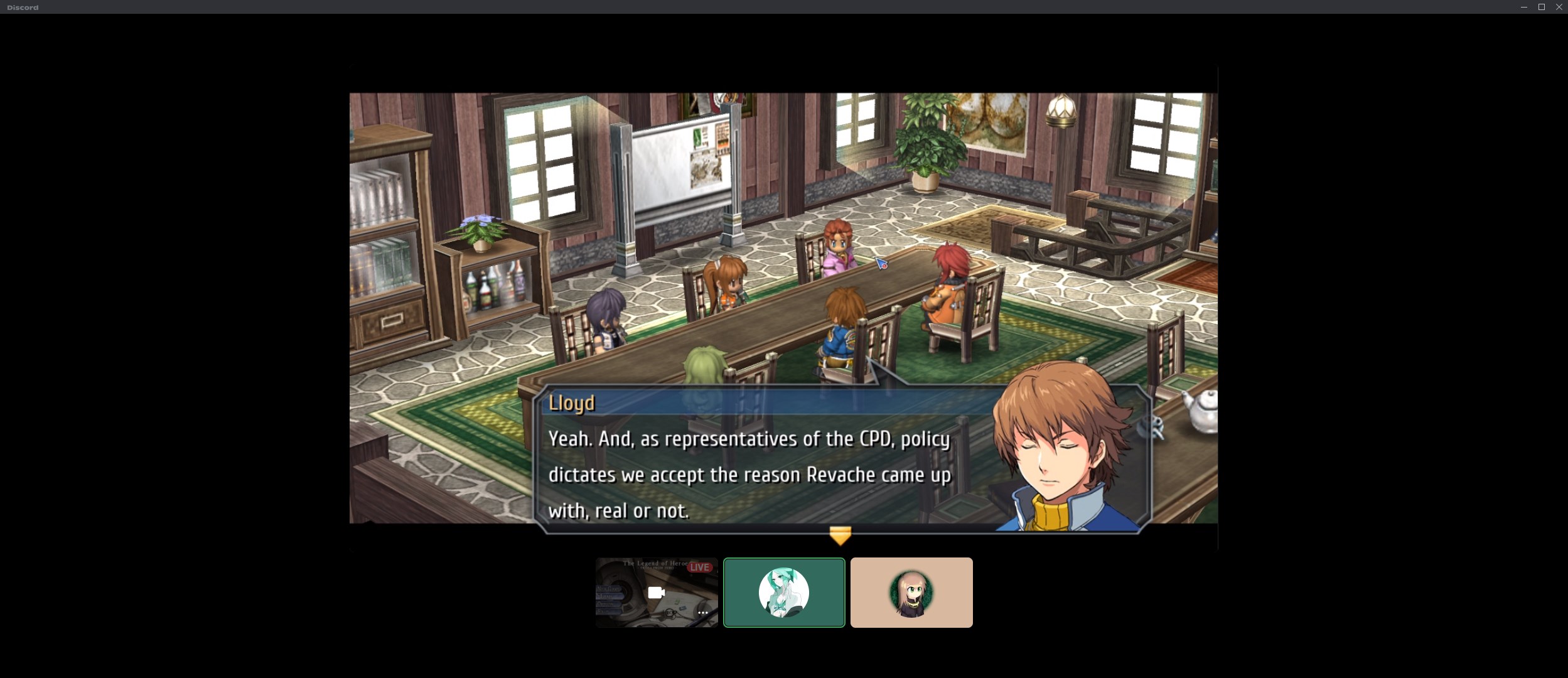
With the new layout for the video call menu, where the members are now placed below the focused person or stream, is worse than it was before.
The focused video or stream window is now smaller than it was before because of how making the stream or video window smaller by scaling the smaller dimension has more of an effect on the area of the window than scaling the longer dimension of the rectangle.
As well, I fail to see what benefit this change brings. The interface is now different and unfamiliar at what benefit? To note, the call member icons are now smaller than they were before. Everything got smaller, there's more negative space to no perceivable benefit.
-

Yeah, this is a baffling design decision. At least make it a different layout option to have the users on the side. It's horrendous on wide monitors, there's so much black space.
 5
5 -

There's already a thread opened for this same issue, you should upvote it and add your feedback there as well.
https://support.discord.com/hc/en-us/community/posts/4420251871255-Voice-Video-call-Layout
4 -
As someone who uses discord vc to help people with code, this new layout makes it much harder to read. Especially when I talk with people who may be using sign language, which means I need to be able to see them as well.
From an accessibility standpoint, this is a bad change.2
Accedi per aggiungere un commento.
Commenti
3 commenti