New UI - It's not good
It seems to have been said several dozen times before, but I guess your bad UI designers need work to do and instead of having an honest review process, might as well just ship a bad UI so jobs can be justified… Nothing you can't sweep under the rug with some classic, ‘people just don’t like change', right?
Lets go over some reasons why this is terrible
• The number of actions required to get to most views has increased. This is especially egregious on a phone, a platform where action density is especially noticeable. This is a huge problem with this update - it is THE issue that has been introduced.
• Accessing the server member list is cumbersome
• Search is just gone, I guess
If you actually think your UI updates are worth it, then launch them as a beta with public visibility on sentiment. Don't ship these bad updates just because someone is bored.
-

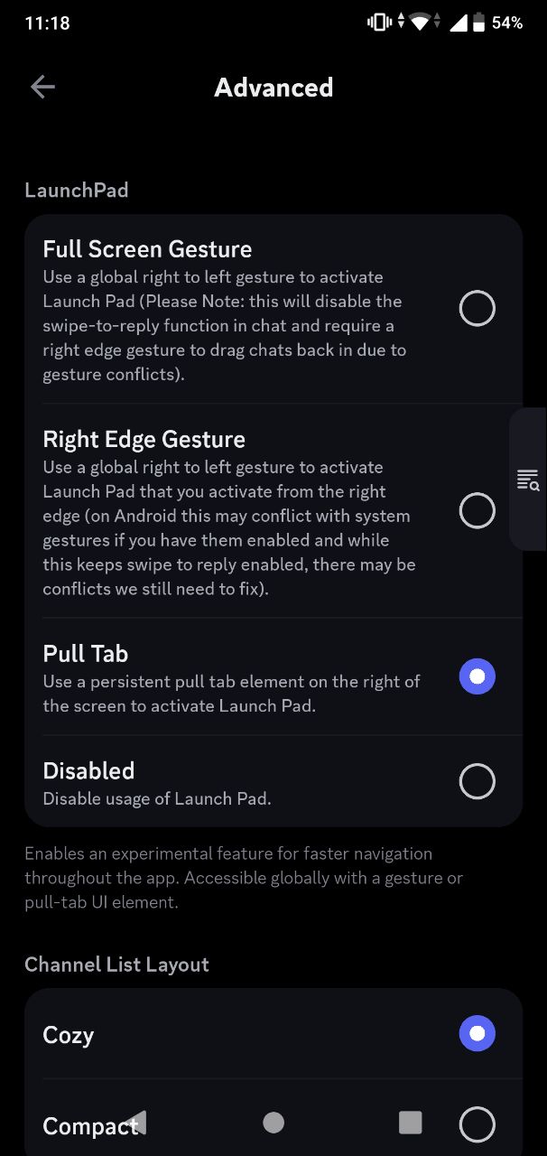
The global search for mobile has been change to Launchpad. You probably wanna go to “Settings” → “Advance” → then see for Launchpad. I know, it's still very buggy, but it's not completely gone
 1
1 -
Nope, not buying it. Nobody should have to use some weird ‘global launch pad’ setting in order to access what was very, very easily and intuitively accessible BEFORE this recent ‘update’ that has actually proven to be, in short order, the worst downgrade in all of Discord history.
4
댓글을 남기려면 로그인하세요.
댓글
댓글 2개