Please improve the UX for disconnecting from voice chat rooms. Place related GUI elements near each other.

A complaint: You can join a voice chat room by clicking on a channel but there's no obvious way (to me) to do the opposite by clicking anywhere near the same area. When you join a channel, your user icon, and username are inserted under the channel. However, when you click on it, no action happens. I would naturally expect it to toggle me back to disconnected.
Workaround to complaint: A small implicit disconnect icon can be found on the bottom of the chat pane, which is definitely not obvious to first-time users. It's also placed far away from your focus, and there's no explicit text of "HANG UP" etc. Better explicit than implicit, IMHO.
Proposed fixes to complaint:
0. Current state (Cannot hang up from this view, you can only move between channels)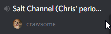
1. Add a hangup button next to the username in the channel.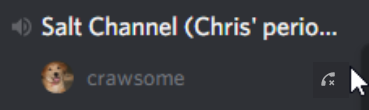
2. Add a right-click sub-menu option to hang up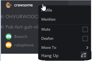
(Crude mockups I know, lol)
Justification: Enough space exists in both the username's channel object and the right-click menu to house these features.
Thank you Discord devs!
댓글을 남기려면 로그인하세요.
댓글
댓글 0개