Italic font change
Changing the italic font back, this literally hurts my eyes and if not change it back atleast make it an option where you can choose between the old one and the new one.
-

Agreed. It's not a font change, but a slight stylisic change. But it's also worth mentioning that "g" is different between italics and non-italics, which makes it especially jarring. There's also the matter that "f" descends lower when it's not normally a letter to do so in the English alphabet.

The change between the letters makes it difficult to process. It is standard practice on most websites and apps to have italics be simply slanted with little other change, or at least as far as I've browsed. Discord going against the grain here is less of a statement and more of a processing problem for the mind.
6 -

Another thing that has changed in the style is the letter "A" and unmistakably the length of the text, the new font/style has a much shorter lenght due to the letters being slightly more compacted
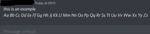
Example of non-italic, old italic and new italic (The bottom text is slightly bigger because it's from an old screenshot so the sizing isn't quite right.
(Now that I look at it, the new italic is also less slanted)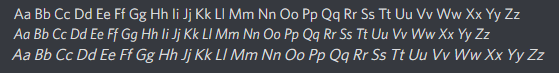 7
7 -
Lower cast "G" is also a victim of this change...
It seems like posts asking about this change are being downvoted. :( Still, I would suggest we all try to say our opinion. You can also leave a comment on the Reddit post about it.
6 -

YES PLEASE. The new one is really hard to read, and while I managed to block updates on my phone, I can't do anything about desktop and I can't exactly ask everyone I know not to use italics.
Discord, PLEASE revert this change.
5 -

I don't see why this change was implemented, as I've only heard from friends that it's made it harder to read italics, not easier. Why fix something that isn't broken?
The old italics, alongside matching the font, are much more slanted than the others.
I wish, if they don't decide to remove the new italics, to at least put in a "toggle" button that turns on "new" vs "old" font, where if they do this, to allow for people who enjoy the new italics to continue enjoying, but the people who struggle to read the new font due to the discrepancies in the fonts would still have the option to go back. The "Appearance" section in discord settings would be a great place for this!7 -
I agree with Luetafaith. An accessibility option for toggling the old faux-italics behaviour would please the largest number of users, by far, without people having to argue over which option they think is "the better one".
6 -
I had the same issue. It actually really upsets me too. Every time I looked at it I had to go find a distraction to get my mind off of the irregularity.
3 -

I put in a ticket about this and described in detail my issues with it as well. As an avid discord roleplayer it's HORRIBLE. I've been rping on discord for over 4 years and there's literally zero reason why they should've changed this. Fonts should be uniform across the entire app. (Different weights are fine!)
I use italics literally every day, all of the time. I accent words with them, and show sarcasm with them as well, and now it's been hard to process and look at it. :/3 -

I've noticed it was wrapped up with a change that made characters have less space between them. The italics are much harder to read without the same space, and that also includes using some characters like forward/backslashes. If we're going to be able to change the italics back, I'd hope we'd be able to personally revert its cause in its entirety.
3
댓글을 남기려면 로그인하세요.
댓글
댓글 9개