New design suggestions (please read)

Like many people, I've talked to I like the new logo but the color hurts our eyes and the new font doesn't feel right. we made a version with old color and font and like that a lot. (limitations caused us to leave the new font)
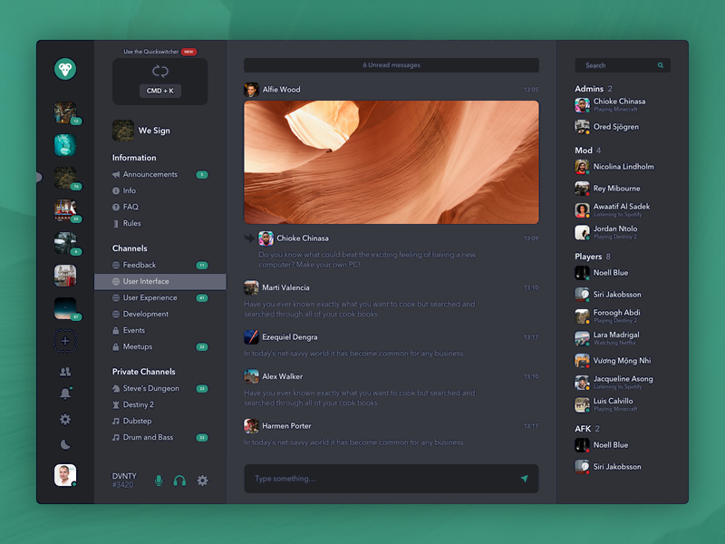
The concept interface looks good BUT the colors don't feel right, my friend made a version with the old colors and we all agree it looks good (there are some artifacts around the text but that's just because we cant edit very well)
0
โปรด ลงชื่อเข้าใช้ เพื่อแสดงข้อคิดเห็น
ข้อคิดเห็น
0 ข้อคิดเห็น