Custom profile banners should have more space in User Settings > My Account so we can see the full picture.

Right now, if you set a custom profile banner and open User Settings > My Account, you'll see how it is cut off because it doesn't have enough space. I think it'd be a good idea to give custom profile banners the extra space they need so we can actually see how our profile looks like when another user sees our profile.

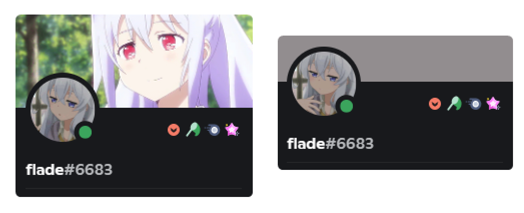
If you pay attention to mini-profiles and profiles, the client has a different behavior when you do and do not have a custom banner, when you have a banner set, the banner bar expands and is taller than it is when you have the default solid color, and I think this should be applied for the My Account tab as well.
Also, if you were asking: many people think this is not intended behavior and has been reported as a bug here, but was confirmed to be intended behavior per this engineer's comment on the Discord Phabricator bug board.
I'd love to read your comments and feedback regarding this suggestion!
-

Approving this suggestion.
4 -

I think this is a great idea if you wanna have your profile look perfect.
4 -

very great idea, nabnab helped too!
2
Iniciar sesión para dejar un comentario.
Comentarios
3 comentarios